Ukraine in Washington, D.C.
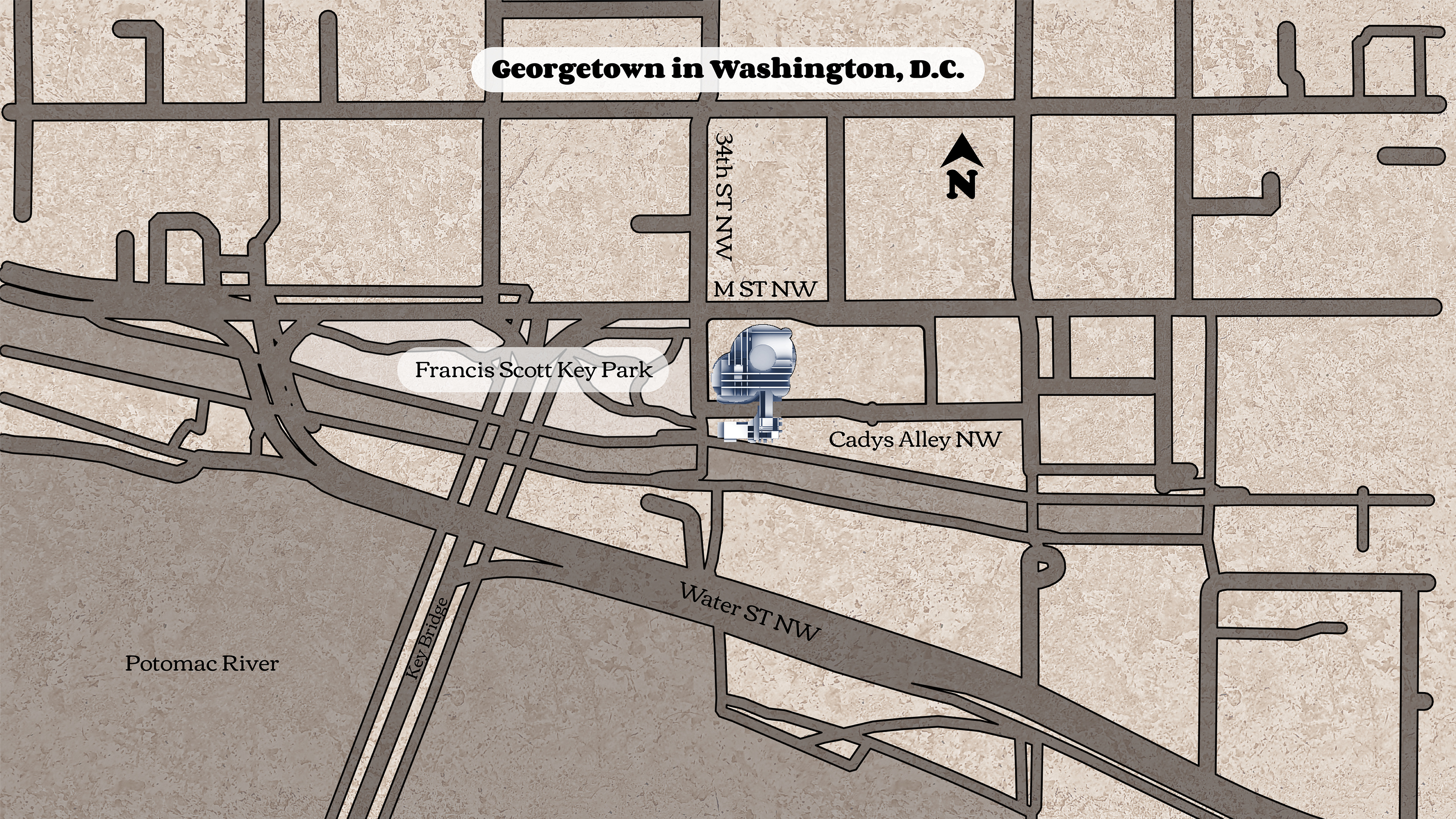
Located along the Potomac Riverfront in Georgetown in Washington, DC, this will take the current place of the Ukraine Embassy, along with utilizing the lot across the pedestrian pathway to its south. The current location happens to be along the edge of the Francis Scott Key Park and lends itself well to allowing heavy foot traffic.
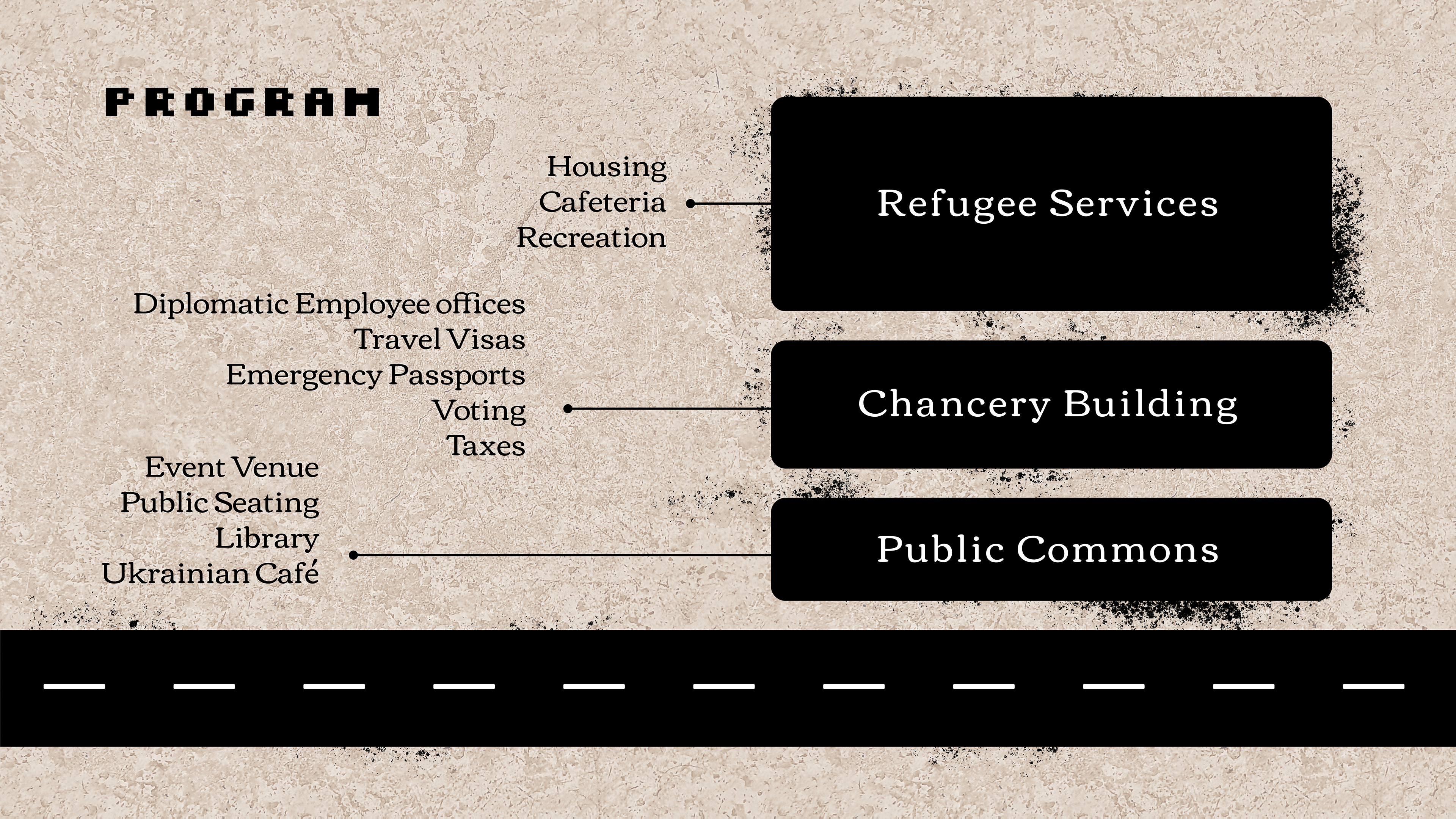
Program was approached in a three-tiered structure designed to showcase and help the people of Ukraine during the war: Public Commons, Chancery, and Refugee Services.
The idea is to bring people to the embassy and have this be more of a cultural center rather than purely a diplomatic space. So this includes things such as large event space, library, an authentic Ukrainian cafe and public seating
The chancery of course will be pretty typical of what we find in embassies today – having not only diplomatic offices but also being a space for citizens to get help with their visas, passports, taxes, etc
And third which is key to this embassy is the vast amount of refugee services. Primarily, this would serve as temporary housing for those displaced during the war. This also includes hosting a feature of amenities including a cafeteria and/or a gym. However once the war is over, this space is to be converted to either student housing for Ukrainian students studying abroad in the US or potentially a hotel.
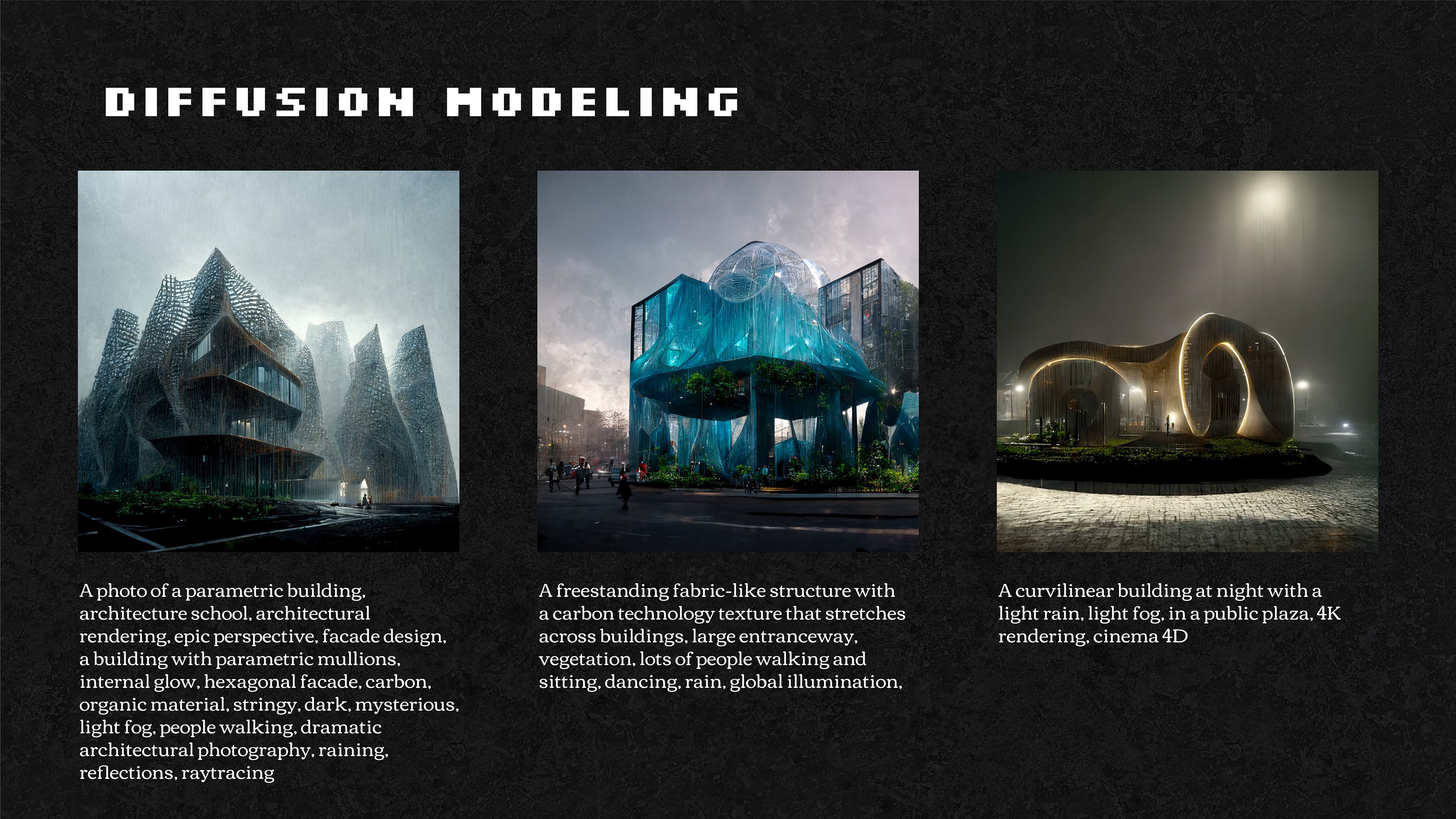
The concept of using diffusion algorithms is still very new in the field of AI and Computer Science. And it’s place in different disciplines, including architecture, still have yet to be fully realized. But with its onset this past summer as this technology became increasingly accessible - figuring out how to utilize neural networks and machine learning algorithms to develop for practical architectural applications, such as an embassy, is crucial in helping us understand how we should be using this as a tool.
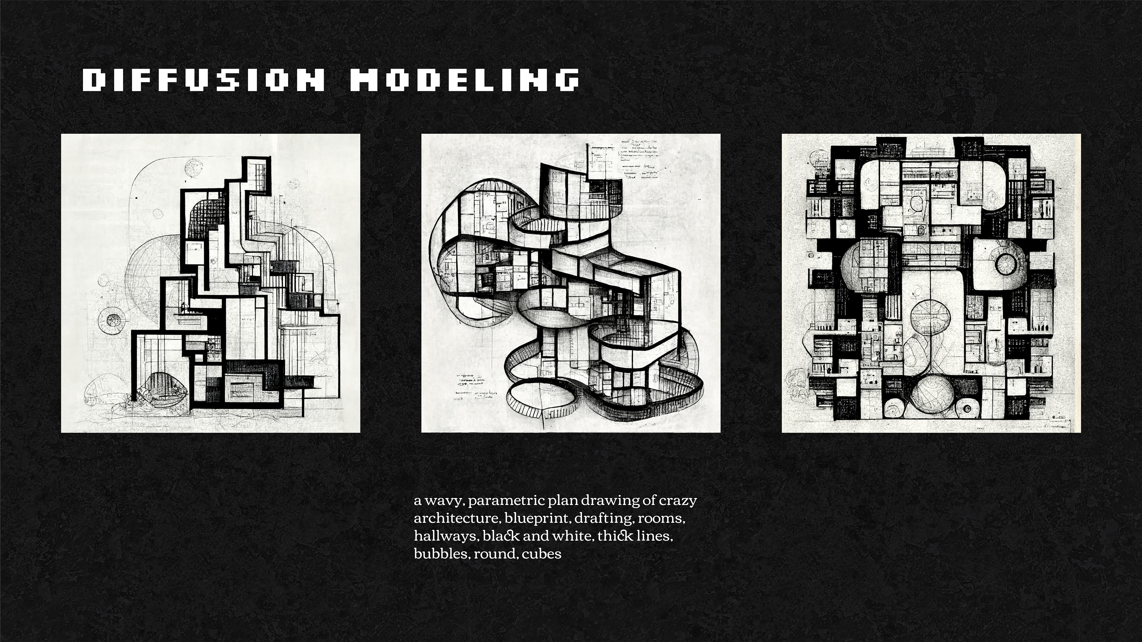
Using a text-to-image machine learning model such as Midjourney or Stable Diffusion, we looked at ways in which we can rethink or reinterpret common architectural features. Whether that be in facade design, structure, circulation, etc. Above are some examples of what we were able to get out of this tool – being as descriptive or discreet as you want. It’s interesting to see what it samples and what it interprets
Early iterations explored the concept of what we have come to think of as traditional plans and sections and estranged them into something in between. The second example above shows the wild variation you can get from the same prompt. And this is actually where I began the design process for the embassy.
Of these estranged plans and sections, I decided to use two fairly different images. One most resembling a traditional section drawing with a central core down the middle, and a partially circular plan that would serve to frame the section. I turned them both into black and white alpha channels, and then transferred them into the modeling application ZBrush where I was able to create a multi-sided box projection of the two Midjourney drawings. The resulting mass served to be the basis for which the rest of the project would be carved out of, quite literally.
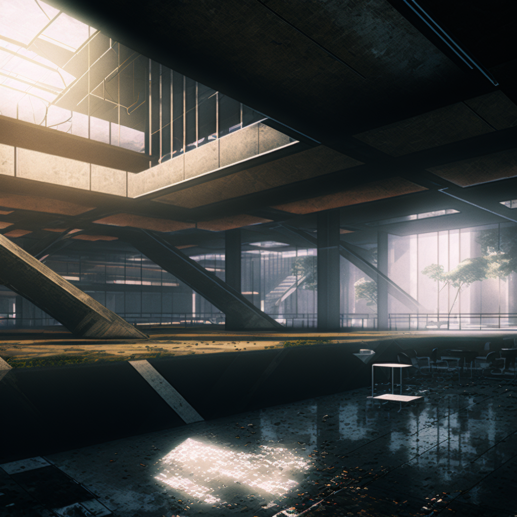
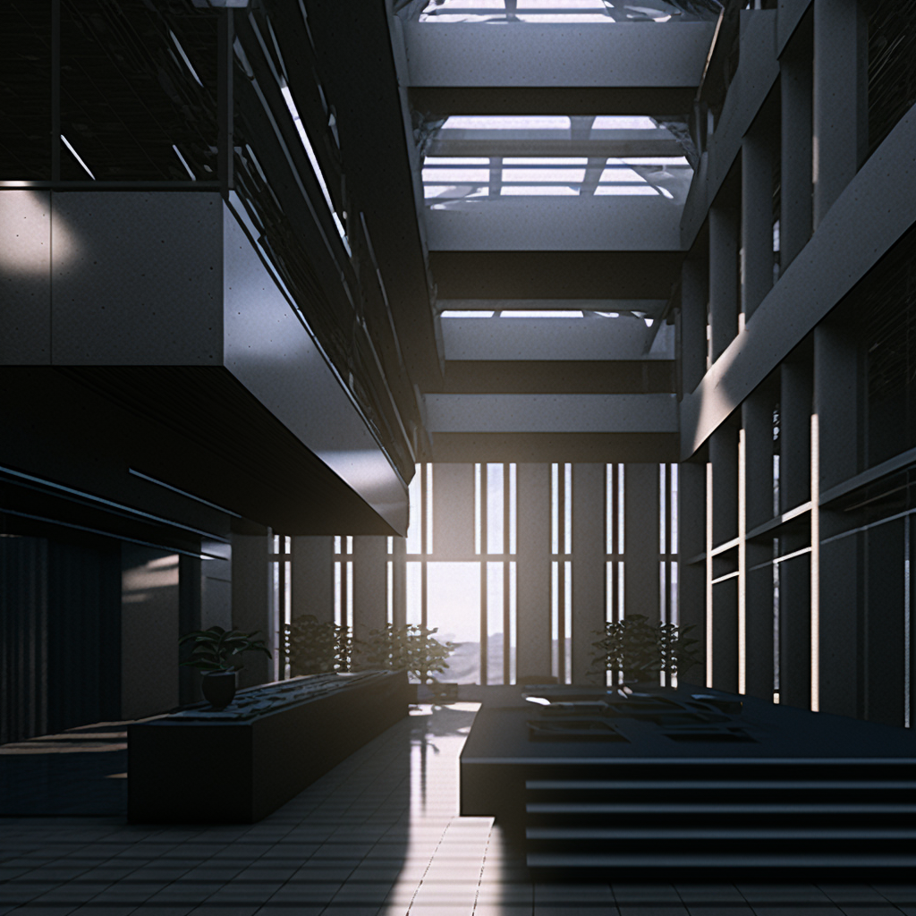
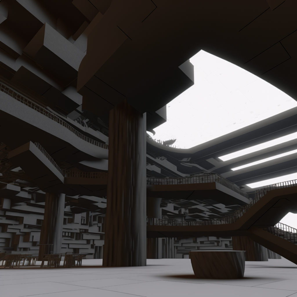
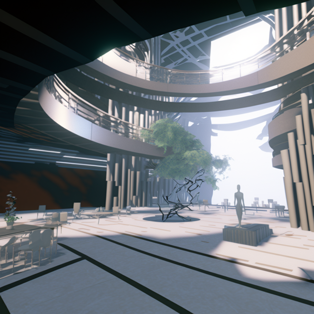
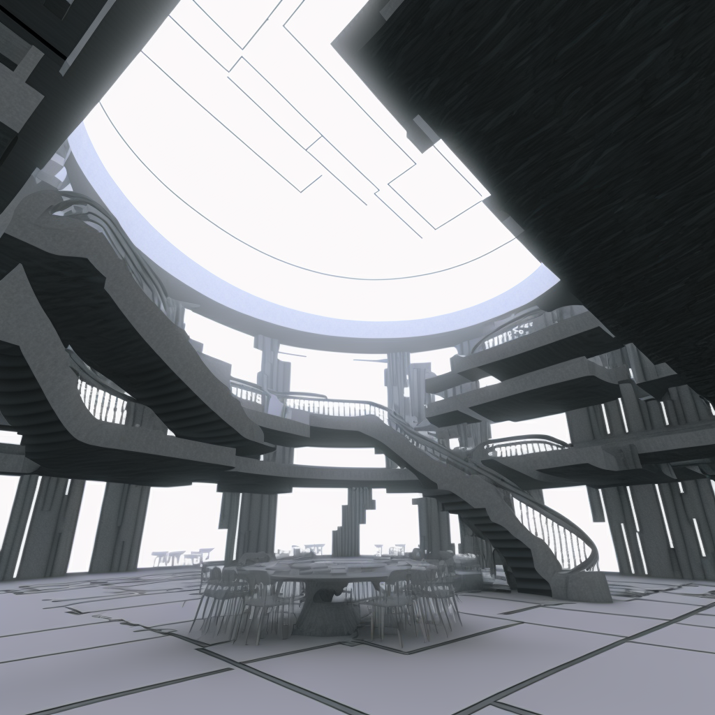
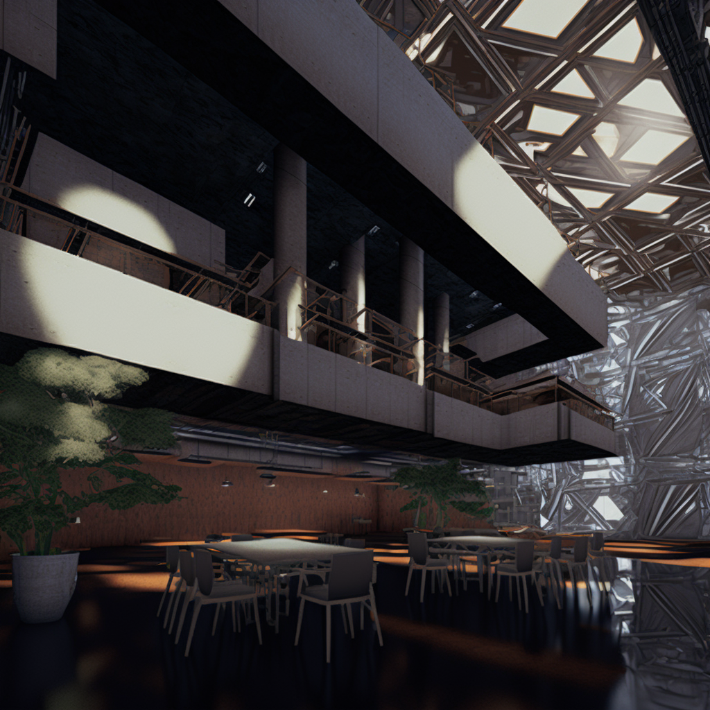
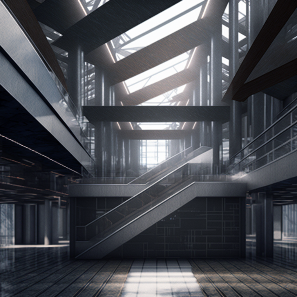
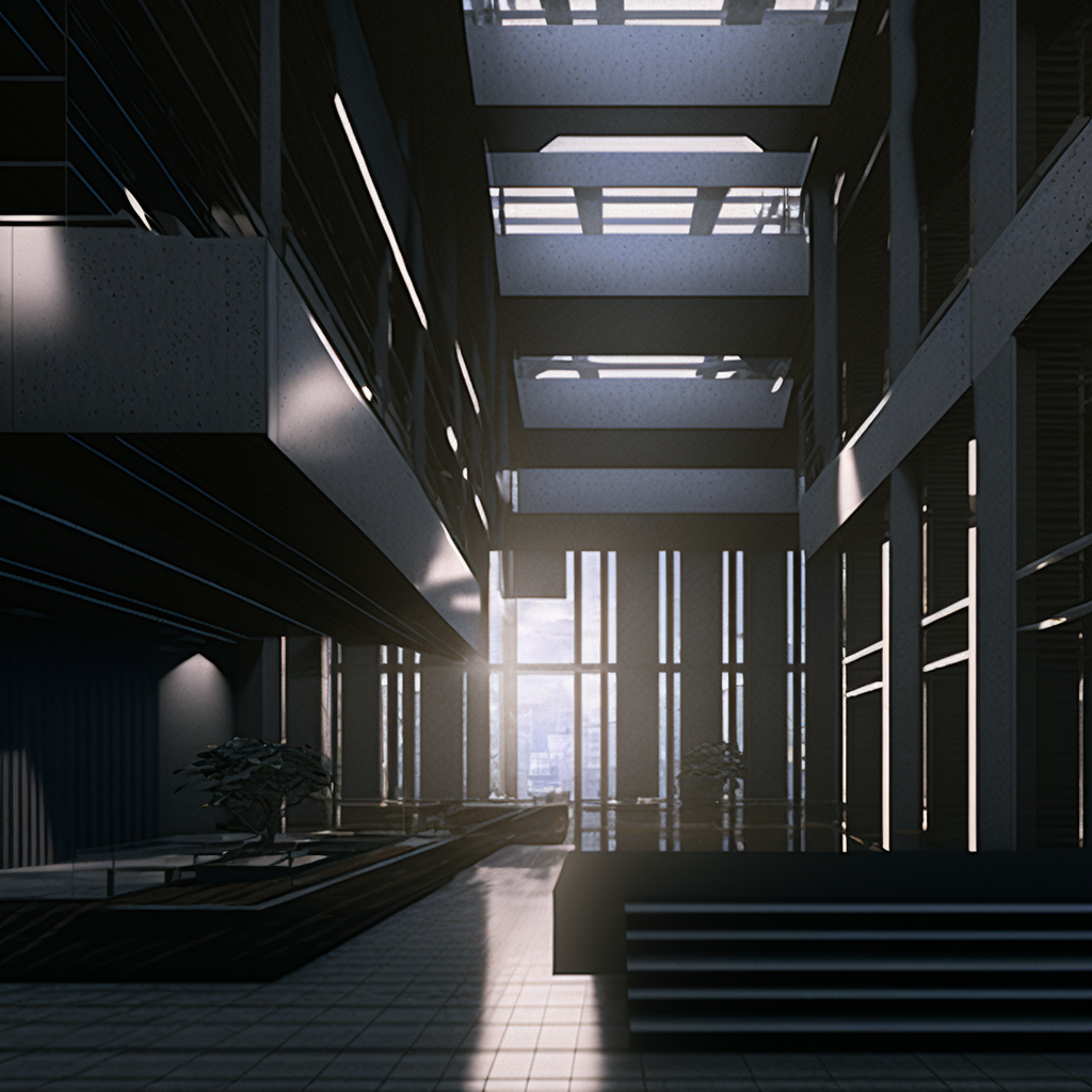
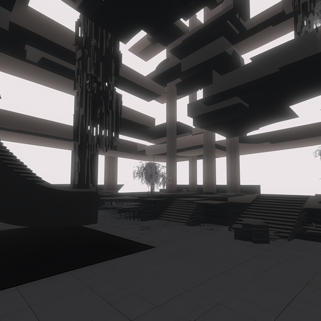
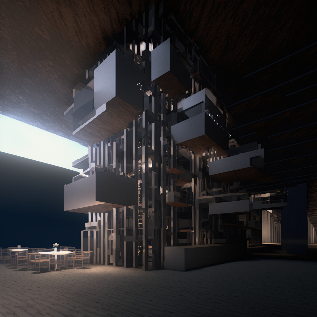
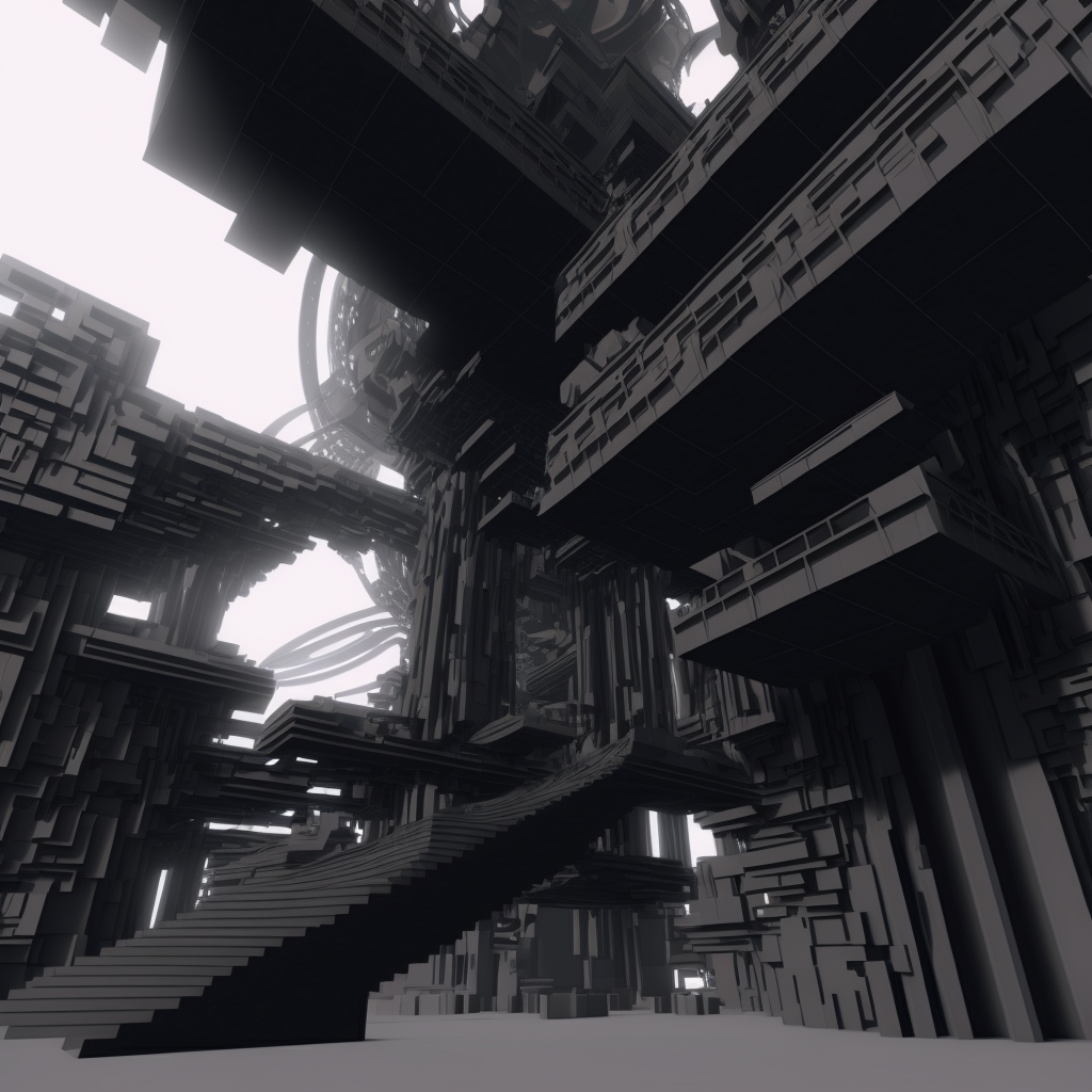
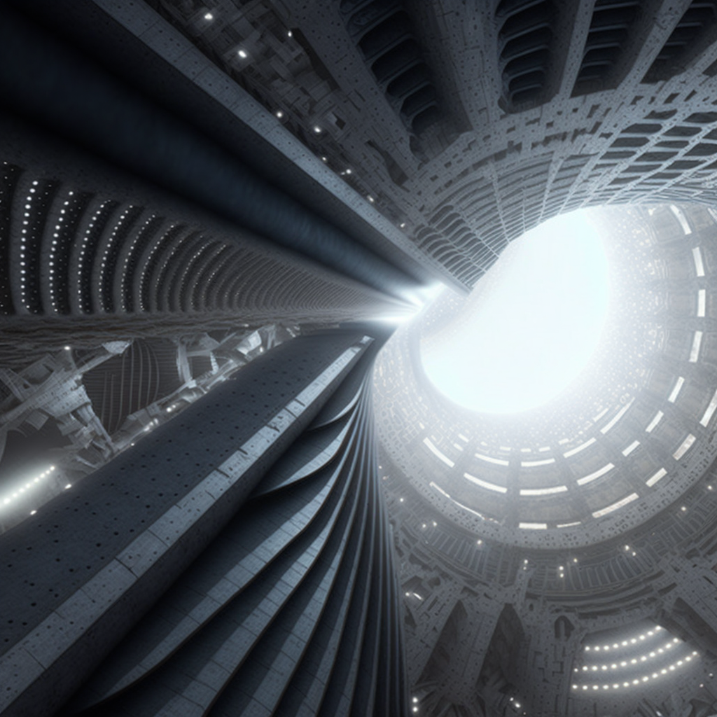
Once there was some sort of form, I was able to begin thinking back to my program and what I ultimately see this project becoming. I was seeking something that promotes a sense of hopefulness during the war. I was fixated on this idea that in the end, there is a light at the end of the tunnel. While it is really tough for the country now, I wanted this building to be a symbol of this part of their history. To show it’s strength, to honor these battle wounds, and most importantly, allow hope to completely penetrate every area of this building. In this case, I saw that as a way of controlling light penetration both internally and externally. I used midjourney to develop some rough ephemeral ideas of what I saw this space to be, given also the general form that I had to work with. Adding qualifiers such as open plan, permeability, lightweight, while also using words such as brutal, industrial, broken, seemed to generate these incredible images that both evoke an immense sense of roughness while also always allowing light to pierce through and break it up.
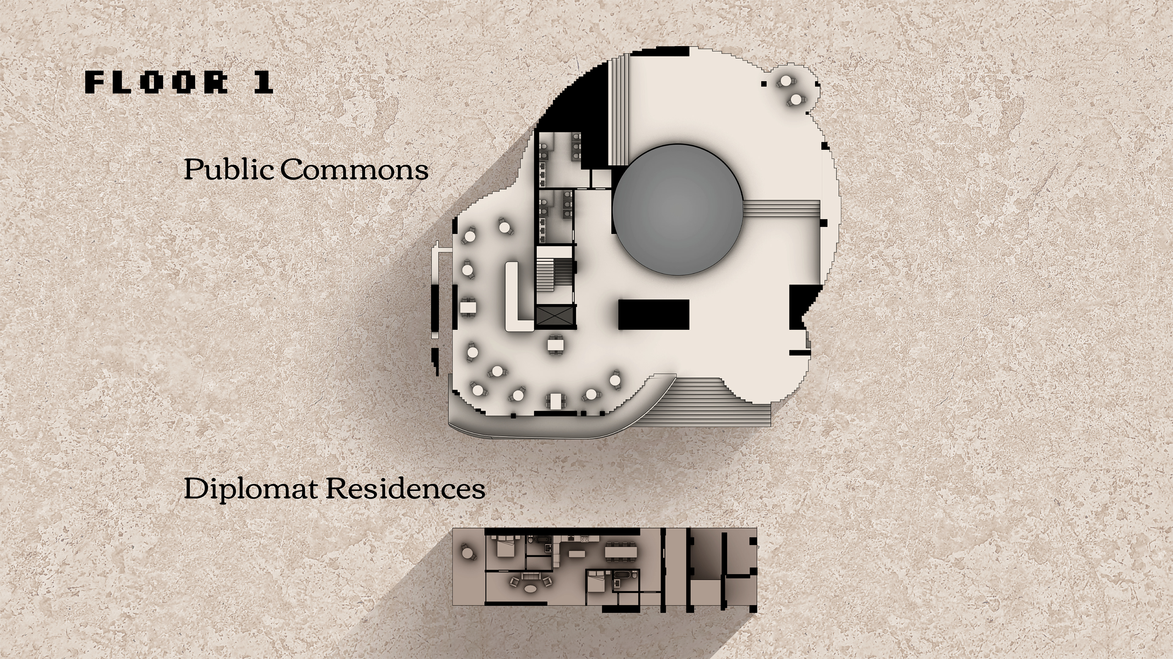
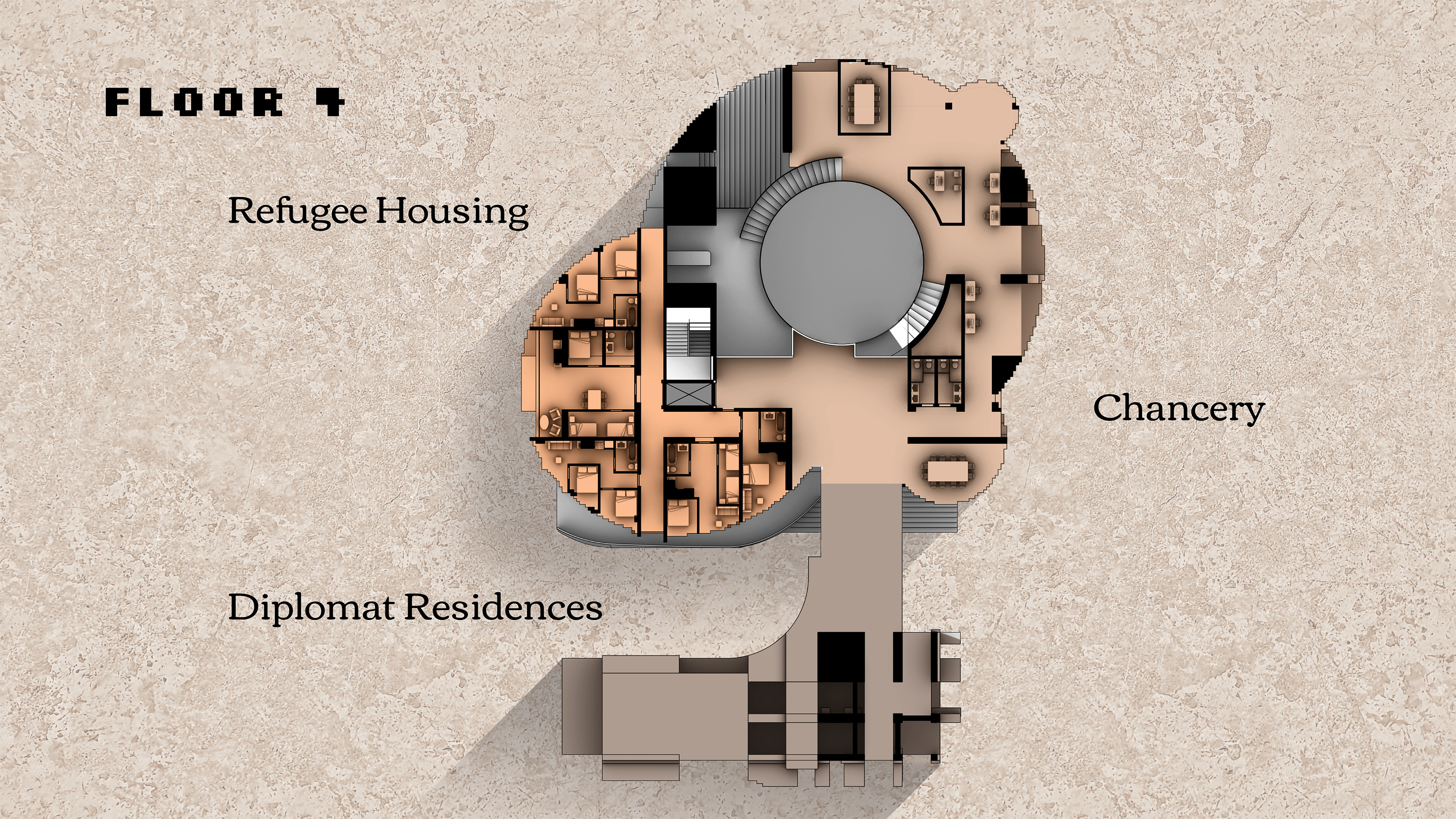
This box projection method I used was great for creating this sort of effect, allowing areas of light and egress to appear in unconventional ways. When looking at it in plan, the building is roughly separated into those three distinct programs, and made the process of building this up to code a little more straightforward.
On the first floor, the entirety of the ground level is designed to be fully accessible to the public – with a cafe and seating area, it invites people in.
When looking at the fourth floor for example, the chancery and the refugee housing is all in this one single standing unit above the public atrium on the ground floor.
Most prominently, there is a large circular skylight that completely cuts through the entire building, helping push the light as far as it can go.
Across the street however, the housing for the ambassador and other diplomats are housed separately. This piece was separated from the top of the original form to fit DC height restrictions. This also helps symbolize the whole purpose of this embassy as it is built for and to support the people of Ukraine without unintentionally over glorifying the diplomatic agents who work there.
In section, it is better to see how permeable the building is as well as how program is separated out. Due to the scale of the skylight, it even extends underground to include for more space for large events, archives, and the library.
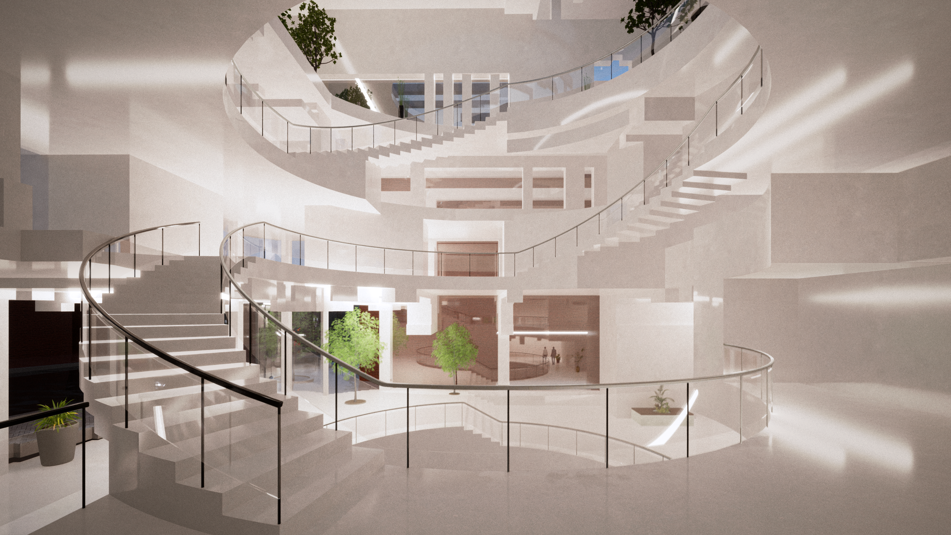
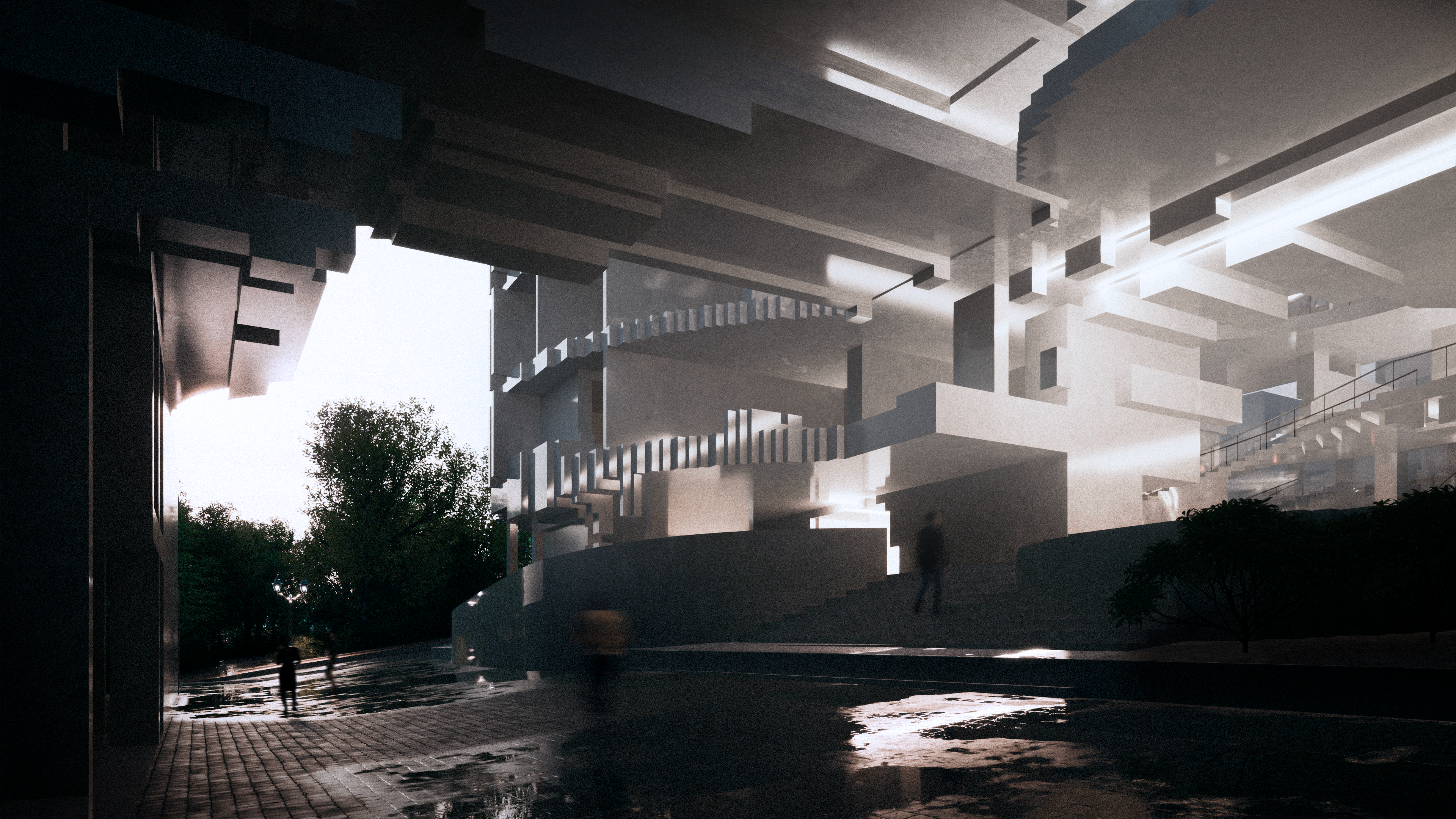
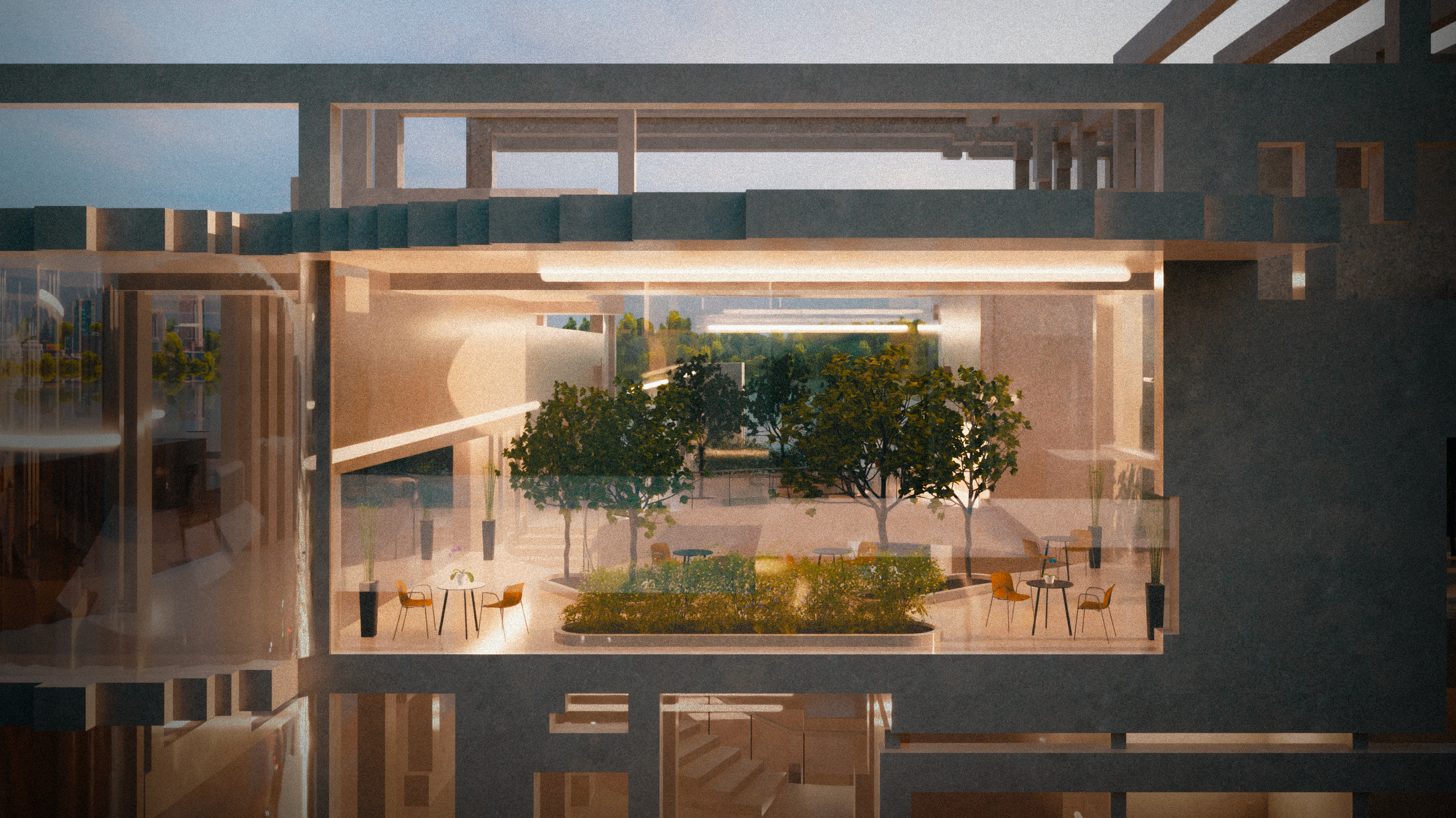
Interior images display how the building projects light rather than just receiving it – showing how it pierces though the tough brutalist exoskeleton. The interior also shows how the large skylight extends deep into the building, not only allowing light to scatter, but create a sense of community within the building, being able to see all angles at once.
Also pictured is the main staircase entrance underneath the skybridge that invites members of the public into the large light filled structure.
The top floors features a solarium-like room that features fresh vegetation and a place for employees, refugees, and guests alike to rest, work, or chat.
Overall, I think this was an intriguing way to approach embassy design. In a way, working in a reverse order, having to manipulate a given form rather than create one from scratch. I for one am super excited about this technology and I am eager to explore how it can further influence our design processes.